More than half of all web traffic now comes from phones, and Google ranks your site based on its mobile version. If your website was designed for desktop first, you are very likely losing customers without realizing it.
Design for the smallest screen first
Mobile-first means starting your design at phone size and scaling up — not cramming a desktop layout onto a small screen. It forces you to prioritize what truly matters and keeps the experience clean.
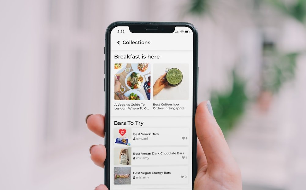
What mobile users need
Mobile visitors are often on the move and short on patience. Make the essentials effortless.
- Fast loading — every second of delay costs you visitors.
- Tap-friendly buttons — big enough to hit without zooming.
- Readable text — no pinching required.
If it does not work beautifully on a phone, for most visitors it does not work at all.
Test on real devices
Emulators help, but nothing beats testing on actual phones. I check every client site across multiple devices and screen sizes before launch to guarantee a flawless experience everywhere.